


Web Design Trends to Look For in 2013
While it might seem like web design has reached a point of maturity over the past couple of years, with designers focusing on multi-year trends like richer typography, larger fonts, and more personalized graphics, the reality is that this area of design is always evolving. In 2013, it's likely that web design trends will make a pretty big leap from desktop-focused to mobile-focused, as an increasing number of consumers browse the Internet more often with a smartphone or tablet device than with a desktop computer.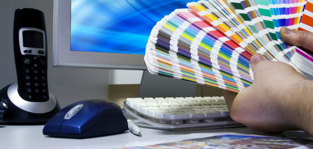
This year, the Internet is going to take on a new look that is more universal across each of these devices, and that will require many adjustments on behalf of designers. Richer graphics, responsive designs, and enhanced typography, will all take center stage this year. Some surprises along the way will also take 2013 design in a few all-new directions.
Responsive Web Design Will Finally Go Mainstream
For the past few years, designers have been locked in a battle between responsive web design and adaptive web design. The dust around this debate seems to have finally settled, though, and it looks like design will trend toward the responsive end of the spectrum in 2013. That means designing with things like jQuery and HML5, creating designs with between 12 and 16 columns that can easily shrink or expand to fill the screen size being used by visitors.In 2013, look for responsive design to go mainstream, with even the smallest websites employing the methodology to cater to their mobile users. Even WordPress has made its pre-installed templates responsive, indicating that this year will be far kinder to those with a small device.
So-Called "Retina Graphics" are Now a Must-Have for All Designers
Apple was the first company to introduce "Retina" technology to the marketplace hewn it unveiled its iPhone 4 in mid-2010. Since then, the company has made Retina Display technology standard across its iPhone, iPad, and MacBook Pro products. Other companies, looking to compete with Apple's products, have introduced their own high-resolution displays, known as HiDPI.To accommodate these displays, designers need to produce larger images that are then scaled down by the consumer's web browser. Without doing such a thing, images appear grainy and fragmented, unappealing to visitors on today's highest-end mobile devices and laptop computers. So far, the transition to higher-resolution graphics has been slow at all but the most popular websites. In 2013, it will become unavoidable.
Designers will need to great double-resolution graphics that can scale down perfectly on HiDPI displays or Retina Displays. These graphics will need to be called using special media selectors in stylesheets and meta tags, and consumers will come to differentiate between sites that look good at high resolutions and those that look pixelated and decidedly amateur.
Horizontal Scrolling is the New Vertical Scrolling
Microsoft hasn't made a name for itself in recent years as a driving force in interface design, but that is starting to change with the company's "Mango" and now "Metro" user interface styles. On its Windows Surface tablets, users are invited to scroll horizontally between a series of flat tiles, selecting and reading the content that most appeals to them. Designers of websites have been intrigued by this new style, and their intrigue is beginning to manifest itself as a new style of design.In 2013, those designers who are looking to be a bit more cutting-edge than their competitors will start designing websites that boldly break the first rule of website design. Those sites will not scroll vertically. Instead, they'll scroll horizontally in a way that is unique intuitive and refreshing for even the most skeptical readers of online content.
Goodbye Gradients, Hello Flat Graphics and Bright Colors
The goal of Web 2.0 design styles was to give nearly every element on a website "realistic" textures that made the website a bit more tactile and presentable. This was a bold strategy when it was new but, like all design trends and other fads, it quickly became tired and predictable. Microsoft, again leading the charge in user interface design, recently left behind a lifestyle dominated by rounded corners and subtle gradients for flat, boldly digital elements that didn't pretend to be anything else.In 2013, web designers are doing the same thing. While the designs of old tried to bring offline textures into the online paradigm, this year things are shifting in the other direction. Websites will stop being shy about the fact that they aren't actually books, and their content isn't actually presented on top of hardwood paneling. Instead, they'll embrace flat graphical elements, bright colors, and a preference for embracing the online nature of their content. It's completely different, and it's going to be completely refreshing for end users.
HTML5 is Finally Eclipsing Flash as the Animated Medium of Choice
Six years ago, Steve Jobs presented the iPhone to an audience of onlookers and boldly declared that it did not support Flash, would never support Flash, and actually relished the lack of the Flash in the phone's Safari web browser. It was a decision that remained controversial until just the past year or so, when HTML5 began living up to its full potential.In 2013, Flash is probably going to take its last lap around the speedway in terms of real usefulness. Most videos are now presented using HTML5 containers, and most animated effects are produced using a combination of jQuery and either XHTML or HTML5 code. CSS3 makes it possible to bring many Flash-style design elements out of Adobe's proprietary file formats.
Web designers this year will forego flash and embrace pages that load faster, work better with search engines, and are more intuitive for end users. It will be sad to see Flash go, especially because it was once a groundbreaking technology with unsurpassed promise, but it's time to embrace greater efficiency and cross-platform compatibility. That's a future that just doesn't involve Adobe Flash.
Menus are About to Get Tastier: The Hamburger Icon
Facebook in 2012 overhauled its mobile applications with a new sidebar menu, giving users access to a wealth of functions that had previously not been supported on mobile devices by the social networking company. To access this menu, a simple icon with three horizontal lines was placed in the top left corner of the application. That icon has, in the months since the update, become nearly universal when indicating a menu for mobile users.In terms of web design, the "hamburger" icon, as it has become known, will become dominant. Many websites display the icon instead of search boxes and navigation icons. When clicked, a menu slides down that allows for robust navigation of the website. It's universal, requires no language, and can be installed in a matter of minutes. This is good news for mobile designers, and it's good news for end users who are looking for more consistency across apps and websites on a daily basis.

.jpg)


Since technology is forever changing, the World Wide Web should follow suit. Anyway, it's great that you have outlined what is expected from websites this year. Thanks for sharing these information to the readers. Please keep sharing more ideas about this. :)
BalasHapusok tank's you :) sorry i have not fluent in the English language :)
Hapus